Innovation Center Environmental Graphics
Tasked with creating a communication strategy applied on the signage and wayfinding system for the Innovation Center of the Science and Technology Park of University of Porto, Claan sought to craft a concept which expands beyond the walls to turn the Innovation Center into a landmark and communicate the exciting creative side of research, experimentation and science. With the opening of the Innovation Center the building itself had to become the communication catalyst of UPTEC’s values. The Science and Technology Park of University of Porto is a space for mutual leverage of skills between academia and businesses. Capable of creating an environment conductive to innovation and to the installation of technology-based and or creative businesses it is an outstanding example of how to bring academic knowledge and business closer together, through its strategy of sharing research findings and fostering local entrepreneurship.
Concept, Brand and Identity
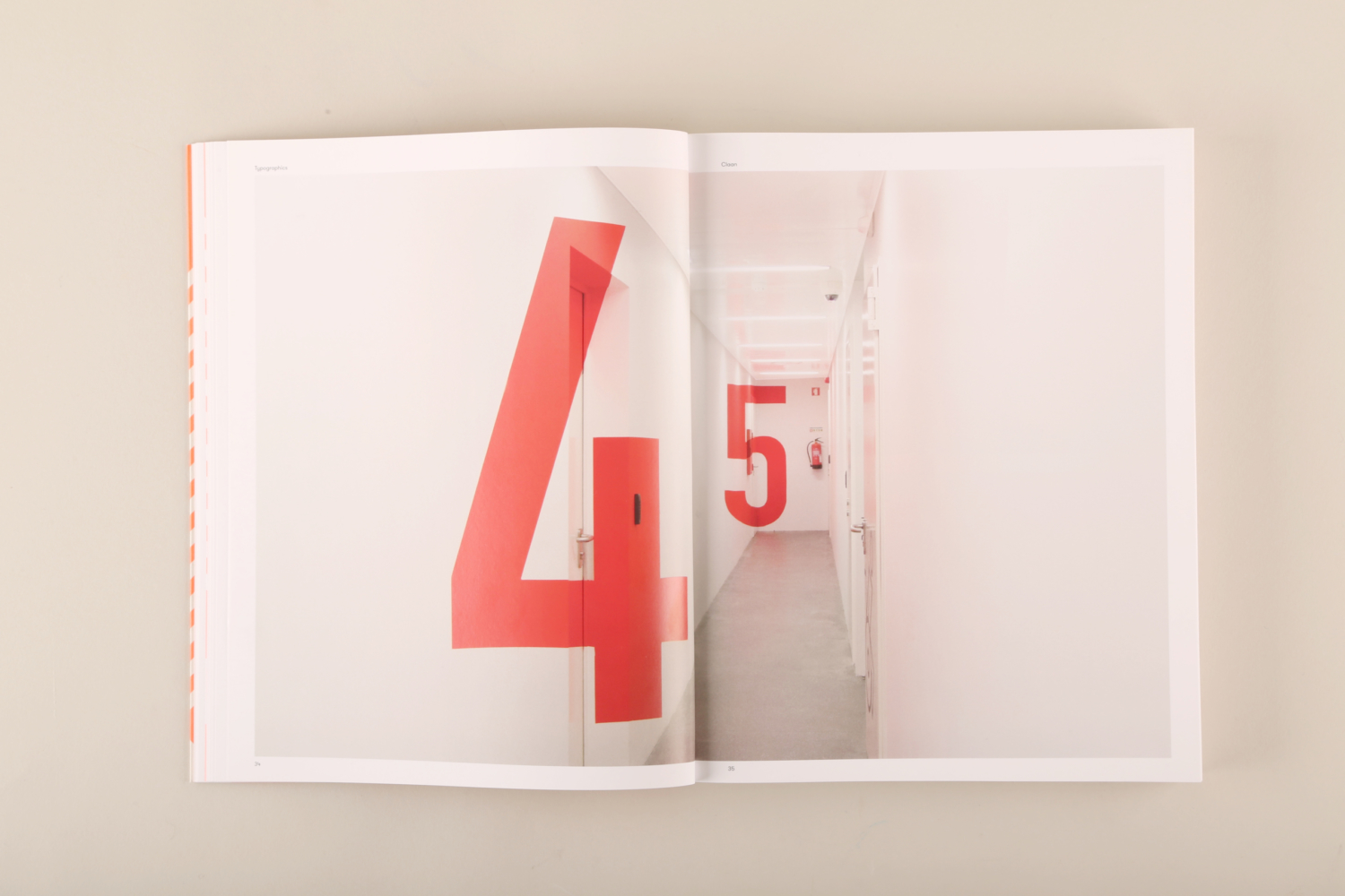
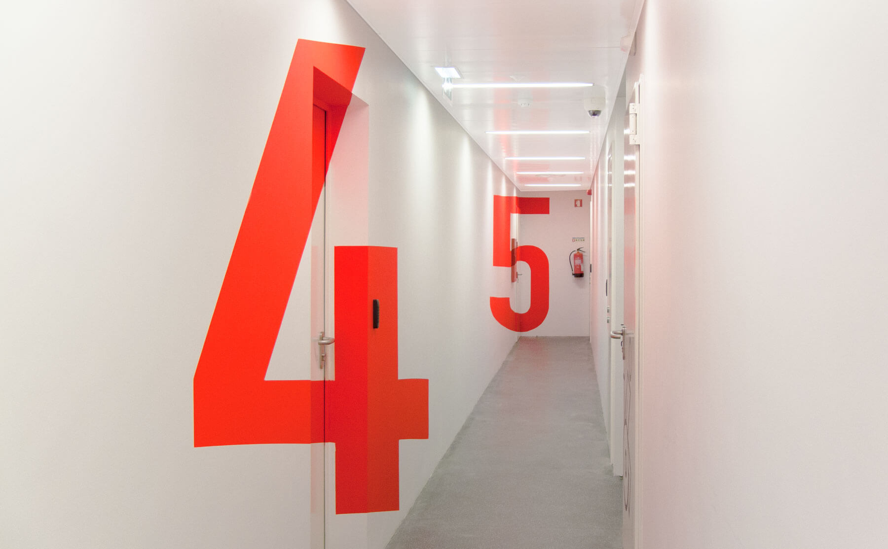
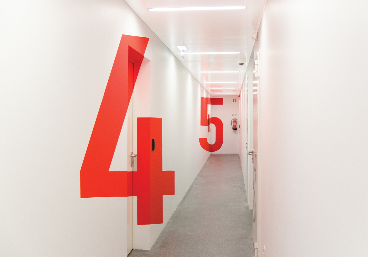
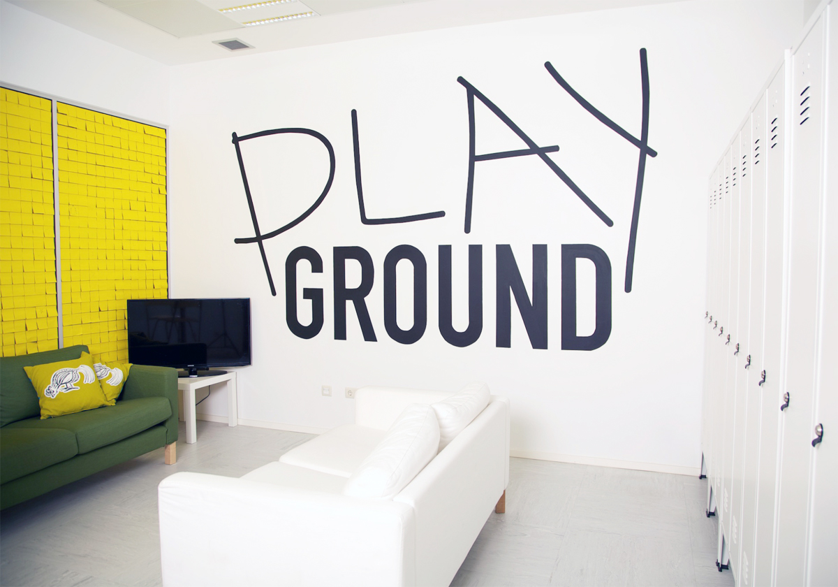
To breathe life, energy and playfulness into the white-washed, dull and characterless corridors of the building interior, the invasive supergraphics of the signage system communicates a break with tradition that plays on both perspective and space, creating illusion throughout the use of the anamorphic typography.
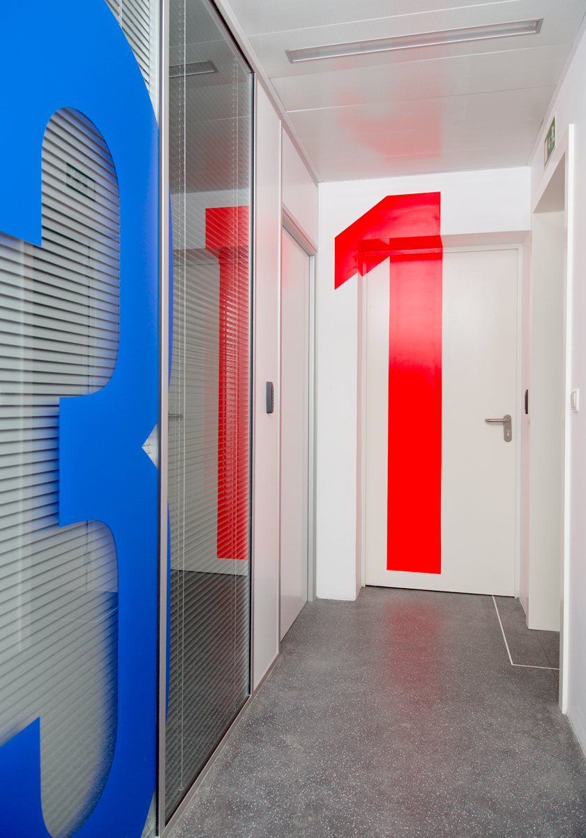
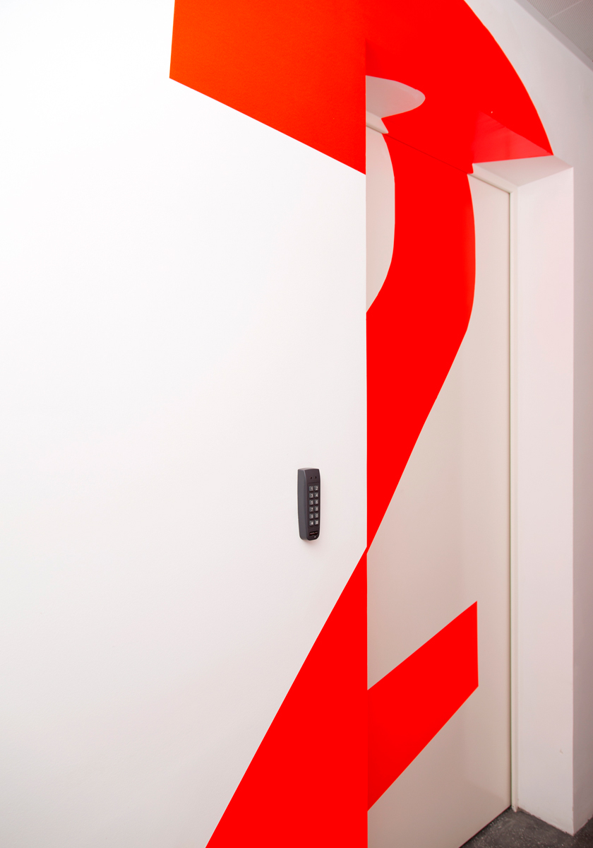
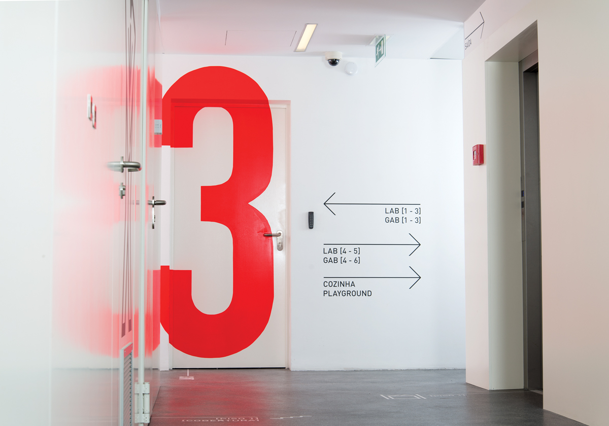
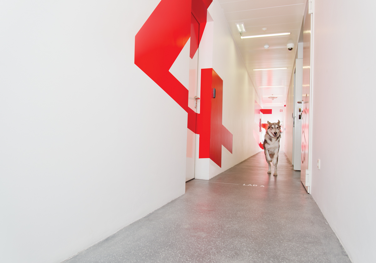
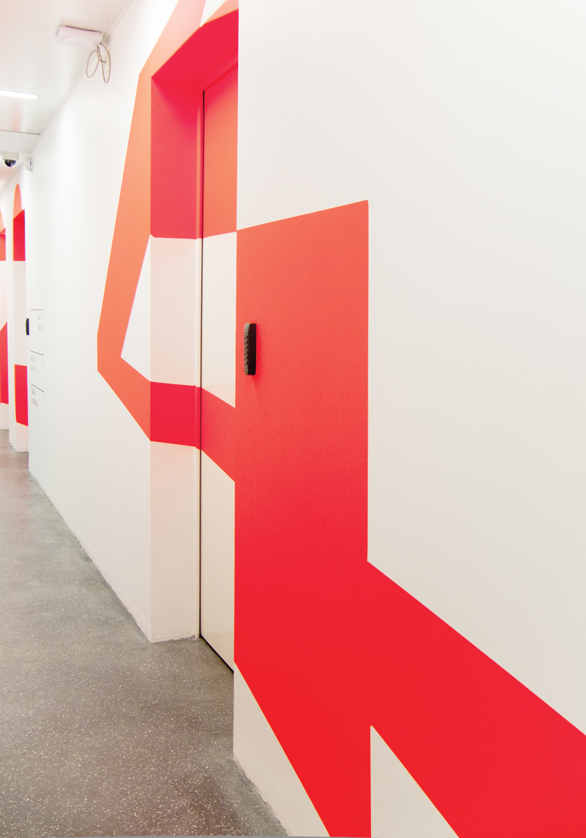
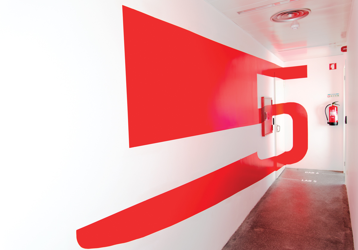
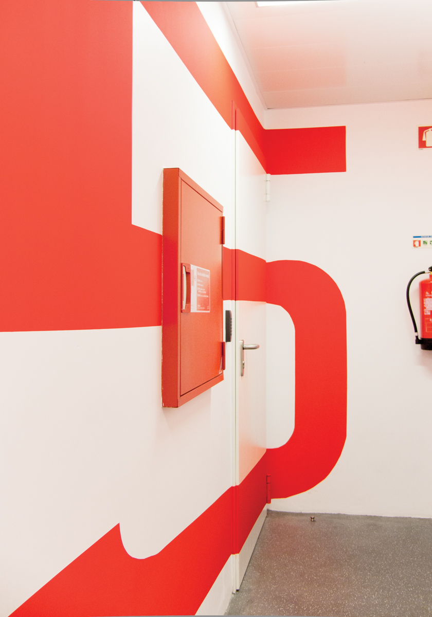
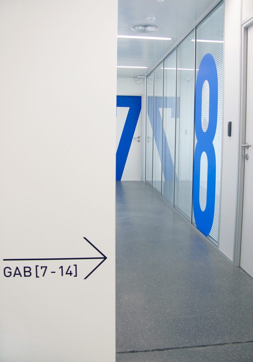
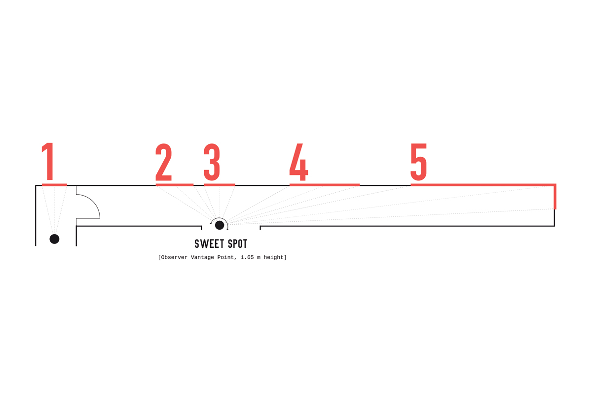
The giant numbers 1 to 5, and the stretching of the number 5 up to 7m long, allow visitors to identify all five lab entrances once they arrive at the passage at the observer vantage point or “sweet spot” and distort as they proceed playing the interaction between the movement of their body and the architectural space.
Signage and Wayfinding System
Designing a signage and wayfinding system goes beyond just creative consultancy and graphical concepts. It is a complex process that requires dedication and time, involving several phases, including data collection and analysis, schematic design, design development, documentation, bidding, installation observation, and post-installation evaluation.
The user journey and the different use cases of the building helped us design a more effective signage and orientation system. Discovering the building’s needs and responses, with tests of spatial implementation, material decisions, and small details about appearance, typography details, colors, materials, and finishes, and assembly pointed us to the best answers for the project and client’s needs.
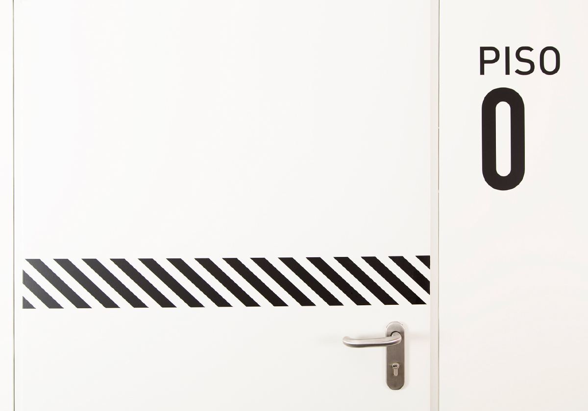
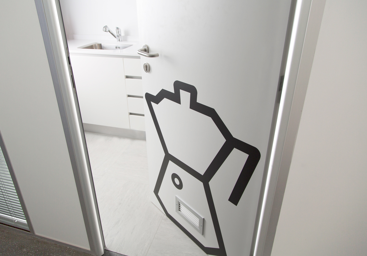
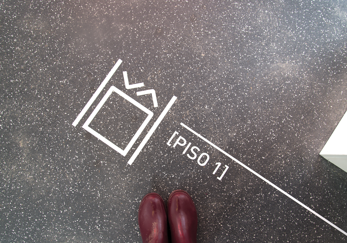
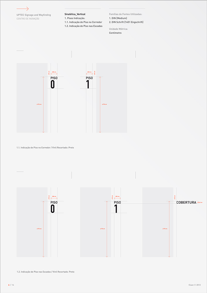
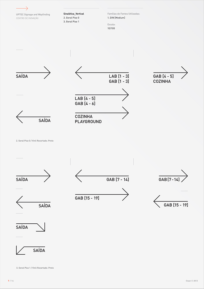
For the complete signage and orientation system we’ve designed various kinds of sign information content: identification signs, directional signs, warning signs and operation signs with iconographic signs as well as maps in key places. To complement the vertical signage, the floor provides secondary, horizontal signage, aid to navigation throughout the floor.
Manual Guidelines
Books and Publications
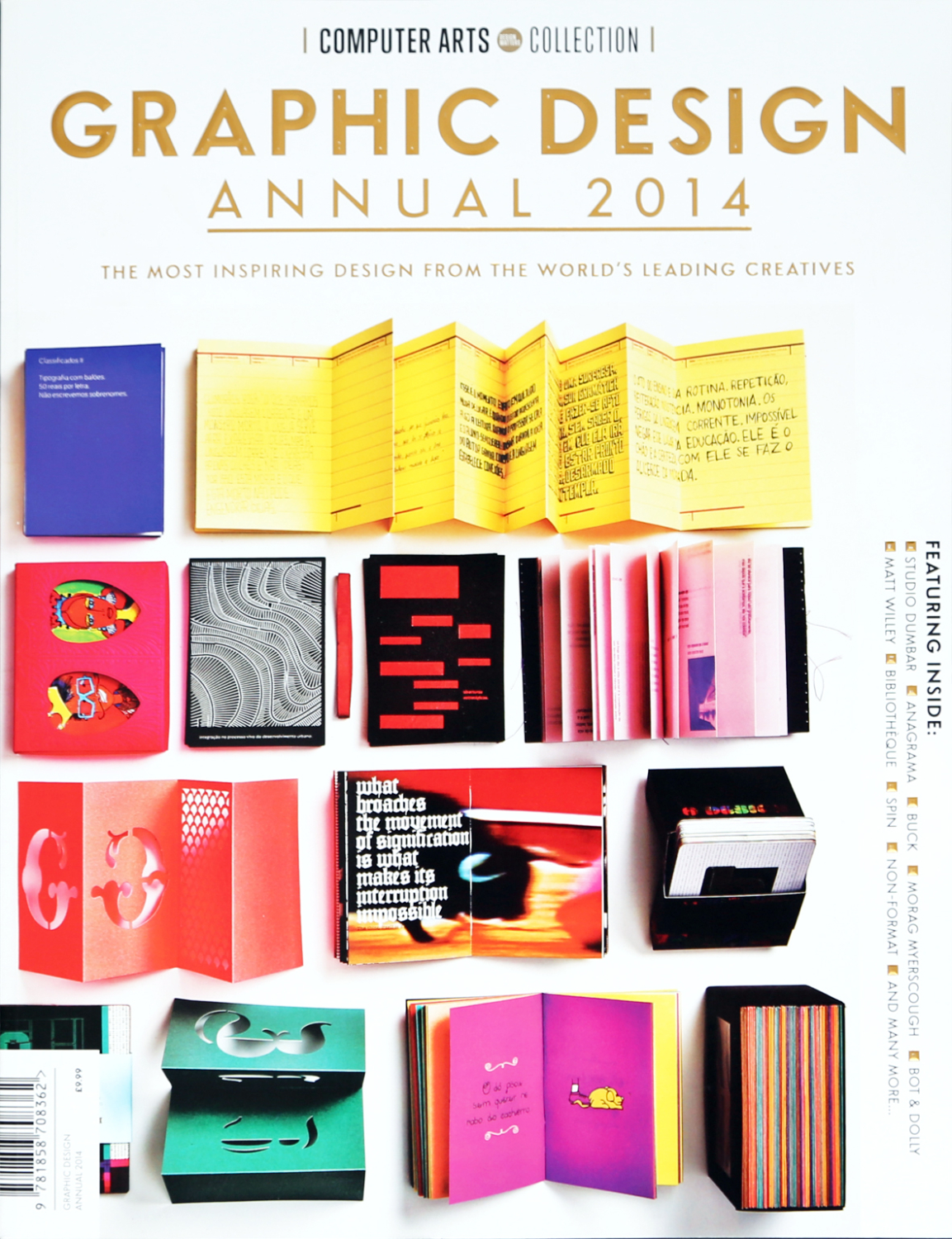
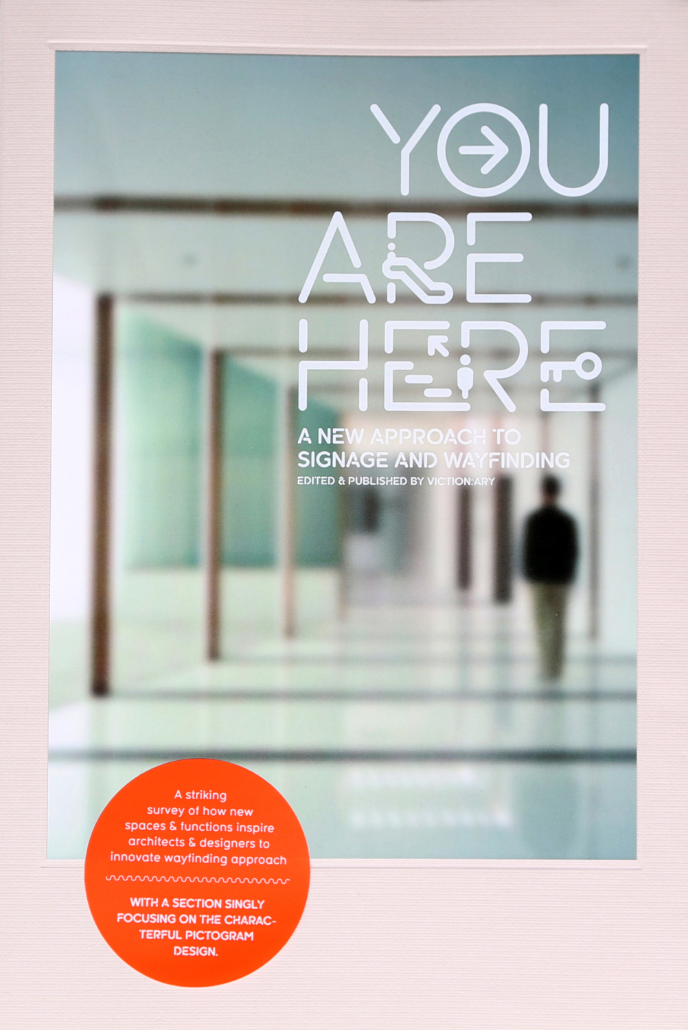
This project was considered one of “The most inspiring design from the world’s leading creatives” by the graphic design annual of the Computer Arts Magazine and was published in several design books around the world, from United Editions UK to Victionary, Hong Kong based art book publisher.